Fortnox
- Purpose and question
The purpose of this study is to investigate the problems that have been identified regarding navigation in complex systems for new users. The system that will be examined is Fortnox's financial management program. Fortnox has provided us with a shorter description where they say that problems have been identified around the navigation of new users, this is partly based on previous students' work but also on a survey conducted within the company. Representatives from this company are also the ones who will collaborate with us in the design group to be able to carry out this study.
The purpose of this study is to investigate the problems that have been identified regarding navigation in complex systems for new users. The system that will be examined is Fortnox's financial management program. Fortnox has provided us with a shorter description where they say that problems have been identified around the navigation of new users, this is partly based on previous students' work but also on a survey conducted within the company. Representatives from this company are also the ones who will collaborate with us in the design group to be able to carry out this study.
”The system should be easy to learn so that the user can rapidly start getting some work done with the system.”
Nielsen 1994
- Understanding the problem
Within Fortnox website there are many built-in systems and features depending on the user's choices and needs. All of these embedded systems are embedded in the program and structured using multiple navigation systems. What has been established at the present time from previously collected data is that especially new users experience obstacles with the navigation in the program. It can be both that the terminology of terms and the navigation itself fails. In this project, we within the design group can adopt principles from IA such as the findability and way of thinking about how Fortnox's various systems should be structured and labeled. Our mission is to further develop and improve an already existing program of Fortnox.
Within Fortnox website there are many built-in systems and features depending on the user's choices and needs. All of these embedded systems are embedded in the program and structured using multiple navigation systems. What has been established at the present time from previously collected data is that especially new users experience obstacles with the navigation in the program. It can be both that the terminology of terms and the navigation itself fails. In this project, we within the design group can adopt principles from IA such as the findability and way of thinking about how Fortnox's various systems should be structured and labeled. Our mission is to further develop and improve an already existing program of Fortnox.
- Gathering insights
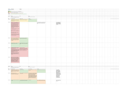
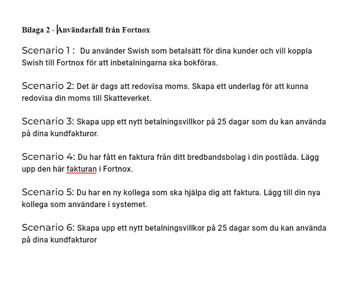
The first thing was needed to do was to gain insights into Fortnox's existing programs. This was done by analyzing Fortnox usability tests, observations and interviews. In order to understand the existing navigation on the program, user cases were also performed to understand the collected data on a personal level. This together with reading through the users' interviews and observations about their successful and unsuccessful user cases creates a good starting point to see problems in navigation.
The first thing was needed to do was to gain insights into Fortnox's existing programs. This was done by analyzing Fortnox usability tests, observations and interviews. In order to understand the existing navigation on the program, user cases were also performed to understand the collected data on a personal level. This together with reading through the users' interviews and observations about their successful and unsuccessful user cases creates a good starting point to see problems in navigation.
- Sitemap and Competitor analysis
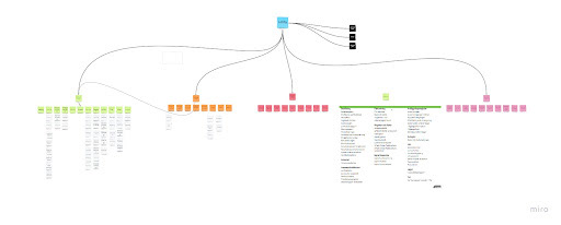
In order to feel familiar and comfortable with the program to be investigated, it was needed to get a better overview of the existing structure and also what the division of categories looked like with help of sitemap.
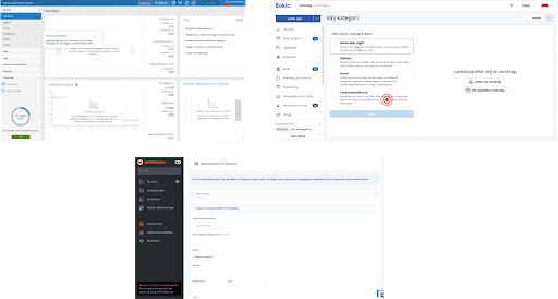
A competitor analysis was carried out to get a further picture of how the client's competitors proceed in their navigation on their websites. This was also done to get a more in-depth look at how accounting systems work and to gain more insight into how other companies have "solved" the problem with their navigation
-Workshop
The components of the workshop resulted in a bullet list for what the stakeholders themselves think should be changed with Fortnox navigation, but also an open map sorting in the form of a newly built sitemap for navigation in the program. The bullet list was compiled on the basis of the discussion questions with which the workshop began, but also on the basis of the discussions that arose during the short sorting took place. The bulleted list is shown below:
The components of the workshop resulted in a bullet list for what the stakeholders themselves think should be changed with Fortnox navigation, but also an open map sorting in the form of a newly built sitemap for navigation in the program. The bullet list was compiled on the basis of the discussion questions with which the workshop began, but also on the basis of the discussions that arose during the short sorting took place. The bulleted list is shown below:
Registers and settings must always be available
Avoid many clicks, do not hide in local menus
Sub Navigation (local tab menus) are hidden
Hierarchy needed
Less scattered and more collected
A fixed left menu
Home page with quick links / shortcuts
Marketplace more clear
Make macro flows clearer (supplier, receipt, invoicing, salary)
The three-point menu should contain pages that are not used that often
More grouped left and right
Prototyping and testning:
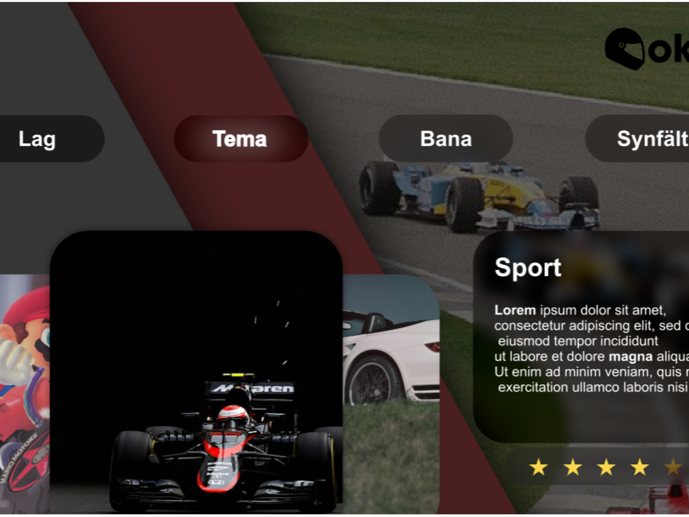
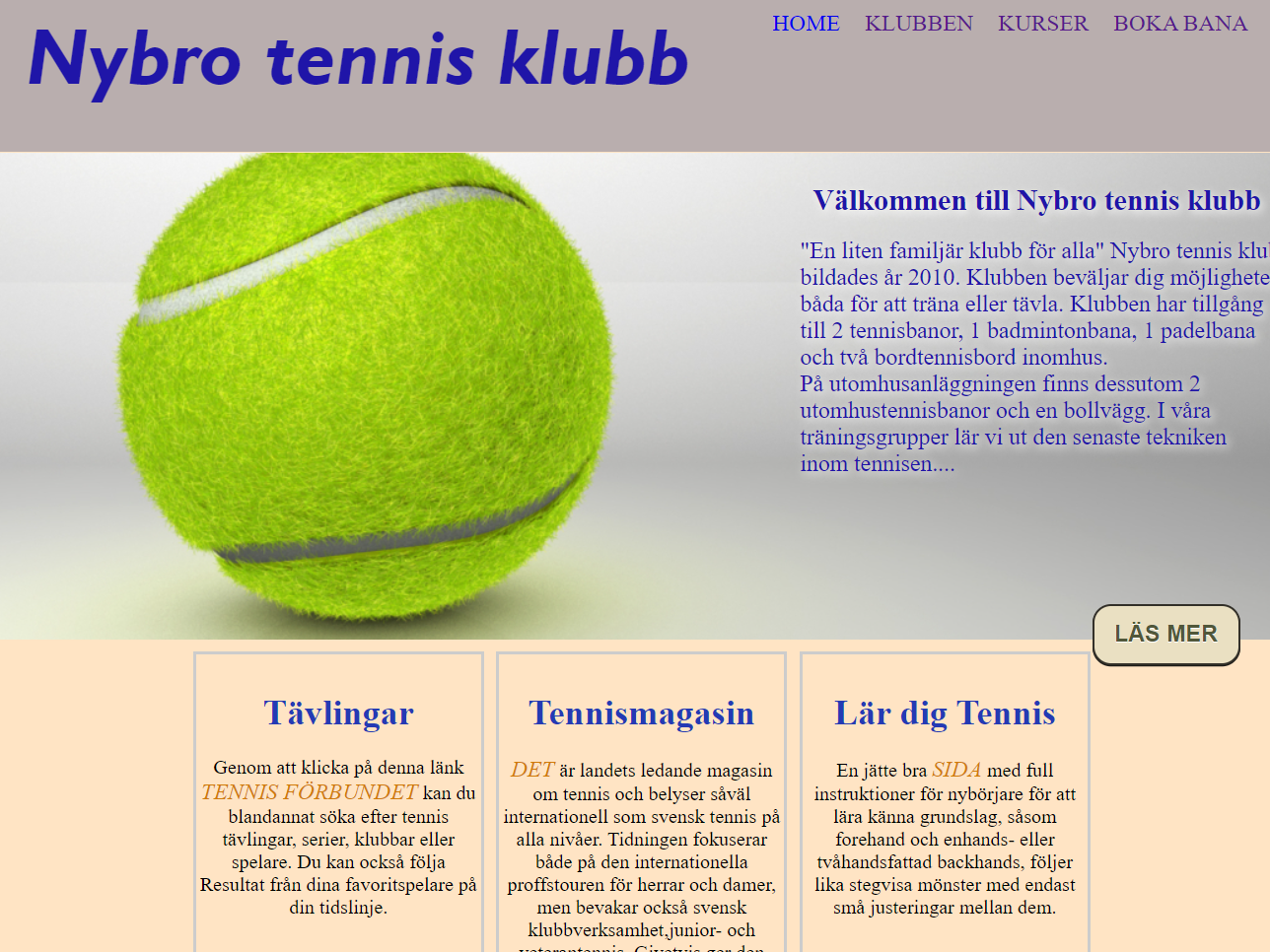
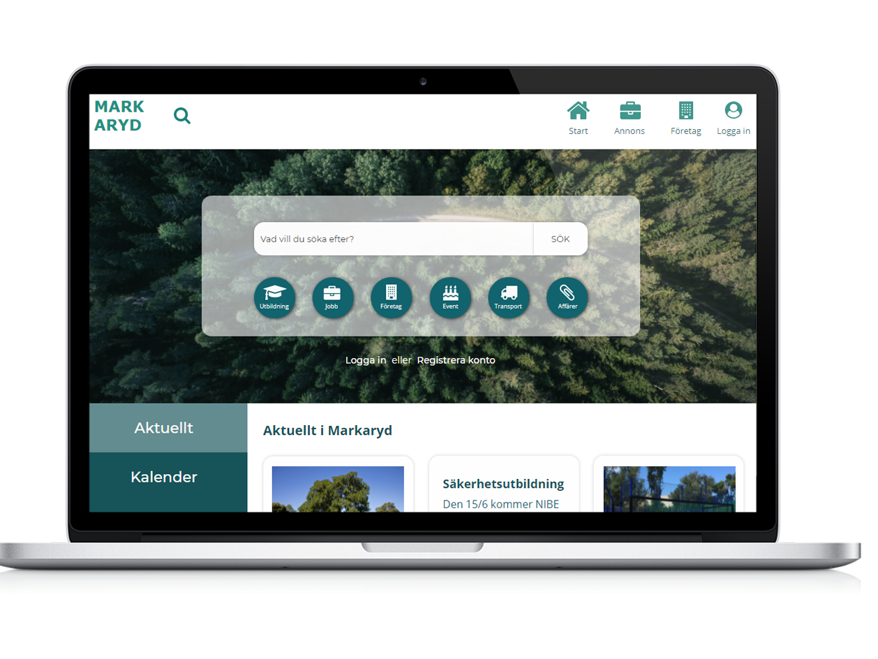
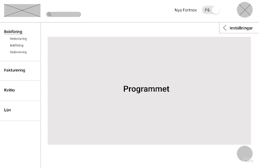
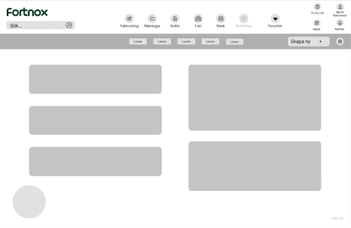
When the different requirements were found out, many individual sketches in web-based format were performed. During the sketch round, two different variants were created on the sketches, where the first sketch variant was based on the left menu for navigation and in the second one was based on barrel menu
as a proposal for main navigation (Se pictuers).
- Interactive prototype
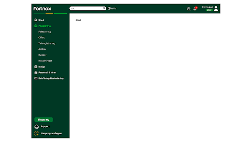
After the prototyping and skissning , the prototypes were tested and evaluated ,in aim to be able to proceed with the development of the final prototype.
After the prototyping and skissning , the prototypes were tested and evaluated ,in aim to be able to proceed with the development of the final prototype.

Result
The concept and the developed prototype are currently not complete, but it is a foundation that needs to be expanded and further developed in order to be put into a use situation. What was deliverd today is limited to only global navigation in the program and does not include other contents like local navigation, other user groups etc..
The concept and the developed prototype are currently not complete, but it is a foundation that needs to be expanded and further developed in order to be put into a use situation. What was deliverd today is limited to only global navigation in the program and does not include other contents like local navigation, other user groups etc..
